Friday, March 11, 2011

Assignment 6

Well, I know we only had a technical week to get this done and I would've actually had these up this past Monday (the technical due date) if it wasn't due to the fact that my cousin (who I'm visiting down in Fort Worth, TX at the moment) doesn't have Internet at his new apartment yet. But yeah - enough excuses. Work time.

Now.

UGH VEHICLES

I hate vehicles, like... even more than I hate drawing animals. Why... why vehicles....

First off, for this assignment, I decided to go back to an older story idea I've been playing around with. I've come up with characters and some rough location ideas, but none concerning transportation within the story. So I took this as a good opportunity to come up with something. Here's the basic idea of the story, which I call (work in progress title) Messenger's Plight.

In it, we follow the journey of the ex-war messenger Hermes as he travels across the desert to the medical city of Asclepeion, in hopes of finding help for his daughter's trauma induced amnesia. Throughout the journey, they are targeted by bounty hunters, looking to collect the price on Hermes' head which is only there because he was framed for something he didn't do.

Here are the designs for the main cast of characters, including Hermes, his daughter Tyche and the bounty hunter Artemis


Hermes: He was once a soldier during the war many years before the events of Messenger's Plight. He used to live as one of the City Council of his hometown, but was soon framed for the near death of his daughter. He now journeys to aid the young girl and hopefully bring back her memories by crossing the deserts to Asclepeion.

Tyche: Hermes' young daughter, stricken with amnesia after she was nearly killed. She's withdrawn and quiet and hardly remembers her father.

Artemis: A bounty hunter tracking Hermes, she ends up traveling with the two after Hermes broke her arm in self defense. She's a rather headstrong person who's very determined. She doesn't believe Hermes at first, but eventually aides him slightly in his quest.

The idea overall is very rough though I did have the designs for Hermes and Artemis already started before this project. I really like Greek/Roman myth, so that's why I was running with the names and the location name choices. Same with roles and weapons, such as Hermes once being a messenger and how he wields a weapon designed after the caduceus. Artemis, in turn, is hunter and wields a bow-like gun.

Here are those initial designs (Artemis' isn't finished evidently here)


Now, I'm going to rush for the next part. I'm at my aunt's using her Internet and she needs to take us back to the apartment (she drove us today). Sooooooo rushing. I will come back later and fill in the other stuff, even though no one probably reads it...

Anyway, vehicle. I designed the vehicle after army jeeps and cars from like the WWII era. I really like those designs and tried to merge them. Here are some sketches and I'll come back with the ref page later (as I forgot to throw that together - man I hate being rushed)

I really didn't know where to start with this though as I wanted something unique, but it still looks kinda the same. I tried to round the car's design more, as I thought that fit more with what I was thinking of, as I picture the cities being composed of rounded buildings too. I had issues initially drawing them, so I used Sai's marker tool in a way that looks (at least to me) similar to how I see some of the trans kids around school draw cars.

Okay, edit. Jeep ref people:


I stuck mainly with the design on the upper left of the third file and came up with the Desert Messenger:


I tried to make it look eh... dirty-ish and all worn, as it is driven in the desert... but I think I failed again. Also, I just generally suck at cars. I linked it to belonging to Hermes with the decor (blue seats, wings) along with the name.

And here's the action shot thing:


Sorry for the rushing - I'll spruce this up later.

Saturday, February 26, 2011

Assignment 3 Revisit

Very quick post here. For our Zodiac assignments, we had to do a final that was the characters coloured and I wasn't aware of that, so I didn't... But I went back and worked on it a bit in between my other projects and here's a coloured version of Ram and Mar:


Ram here is very simple, mainly due to him being a shadow, but I also made him a bit smokey-er here. Mar is also clothed in yellows because the Ram's colour is yellow.

The idea of using textures as base colours came from an anime called Gankutsuou (がんくつおう): The Count of Monte Cristo. I haven't seen much of the anime (only and episode or two), but it's based very loosely off the novel of the same name.

In the show, they do something similar, as seen here:


Mine of course isn't as detailed, but being as Mar is a simple creature (and the entire idea I guess is supposed to be uhm... "simple") I didn't want it as detailed and flashy as in The Count.

But yeah, that's the coloured version - just needed to post it before I forgot.

Friday, February 25, 2011

Assignment 5

Okie dokie... Assignment 5 time. I don't think this post will be as long as my previous ones mainly to due to how fast I finished this assignment and how tired/out of it I am at the moment. I just have to get this thing posted before I forget, because... I'm out of it.

Anyway, for this assignment we had to take our favourite superhero/villian and make them either extremely old or extremely young and then do three outfit turnarounds for them as well as an action pose. Or later we also got the option of doing our own hero/villian and doing the same thing (I do believe) and at two different ages. I did the original assignment, because I was cool with that.

For my hero, I did Iron Man, because I really like Robert Downey Jr. I'll say it - I have no problem sitting around looking at photos of Robert Downey Jr. That is just soooooo fine and okay with me. Yup. Just fine, just fine.

Anyway, yea, like always, I went and found references of Iron Man/Robert Downey Jr and here's said reference sheet:


Some of those were found on Google and stuff, but most (along with many many more : ) ) I got from here: http://robert-downeyjr.net/gallery/index.php, a lovely RDJ photo gallery website that I enjoy very very much. Haha

Now, for this project, I decided to turn Iron Man/Tony Stark (lol, first time I typed Sark instead of Stark - that's funny because a character from the original TRON's name was Sark.... ANYWAY) into a little kid/baby/toddler. I did consider the other end of the spectrum, but I don't really like drawing older people. I don't really like drawing super little kids either, so you know... it was going to be a bit different for me either way that I sliced it.

I had found Old Man Iron Man pictures online too, though you could also argue that some chibi Iron Man photos look like little children and such, but... eh.... yeah. Now I'm getting off topic. Anywho, carrying on.

Here's the outfits I did up for him:


I of course did the Iron Man suit (this one being the Mark V) along with a few of Tony Starks outfits from the films (my main reference - remember: Robert Downey Jr). I did his leather jacket outfit thing from when he visits Rhodes at the Air Force Hanger after he returns from captivity (Iron Man), his business suit from his initial presentation of his Jericho missiles before he was captured by the terrorists and made the Mark I suit (Iron Man I), an outfit based off his general workshop attire (Iron Man I and Iron Man II) and then his racing suit from when he was in Monaco (Iron Man II).

I know I was only supposed to do three but you know: Robert Downey Jr. I could have easily gone on and done like... the other Iron Man suit designs (you know, like the Mark I and the Suitcase suit from Monaco) and like... Tony Starks 80 bazillion others suits and outfits he wears through the films. However, I didn't, because... I didn't have to and had other things to do, though I might go back to it later or something...

Now for the action pose, I did this:


This is similar to the promotion art of Iron Man for the first film, but you know, featuring Iron Baby. This pose also seems to be very popular in Iron Man images in my opinion (the landing, cracked ground, kickbutt look at the camera thing) besides the typical images of him flying or pointing his ready-to-fire repulsor glove at the camera, so you know, good representation of him.

I had issues creating that smokey look on the photo, but was glad I pulled it off.

But yeah, anyway... uhm... Baby Iron Man... Or Iron Baby, because that's a funnier name. Yeah... Iron Baby.  

Yeah...

Anyway, enjoy and find these two image as amusing as I did (these are NOT MINE)


Sunday, February 13, 2011

Assignment 4

Assignment 4 time. This week, our assignment was expression sheets, though like always, we had parameters to fill besides just the expressions. The rundown was this: Using a character idea from the generators found on the website, Seventh Sanctum.com, we were to create a character that fit into the universe of the game/movie/cartoon show we were given. We then had to create a small expression sheet of 7-8 expressions for them.

I was given Samurai  Jack for my style and on Seventh Sanctum, I used the Fantasy Fusion generator. That generator basically gave out fusions of human and mythological (sometimes not really - like a human/hippocampus mix) creatures. However, we were allowed to use the other generators and if there was something we didn't think would fit in our description, we were allowed to change it. I did that for my generated creature and had picked the following:

"The fearsome, world-weary female half-Kitsune soldier. She has a feminine build. Her wardrobe is artistic. She appears far more non-human than human."

I took the human part of this description, because as far as I know, there aren't crossbreeds like that in Samurai Jack. However, I do know there's aliens and robots galore in that show, so knocking out the human part of this character idea allowed for her to be an alien, which is what I did. Besides, the description says she more non-human looking than human, so I suppose it works either way.

So, for research I naturally looked up images from Samurai Jack and looked up images of foxes and kitsunes - the Japanese word for "fox" as well as a type of demon/spirit found in Japanese folklore. I also watched a few episodes of Samurai Jack online to get a feel for it. That and it's hard to find decent screenshots from that show online, believe it or not, though there is a very good blog that has a post featuring some of SJs background art: http://madaboutcartoons.blogspot.com/2007/07/samurai-jack.html


Also included on the fox/kitsune sheets are cartoon/anime/game kitsunes I know of, such as Ninetails and Vulpix from Pokemon and Crazy Redd from Animal Crossing. Another notable kitsune is the Nine-Tailed Fox Demon, or Kyuubi, from Naruto.

I didn't do too many sketches for this character, as I do with the other ones. I just looked at Samauri Jack art and watched the episodes and started basically with a silhouette of a character. I went and built it up from there. Here's some process screenshots I took while working on it:


I know the description said the character was suppose to wear "artistic" clothing. Well, as a warrior/soldier, I tried to make her armour very decorative, but I tried to keep it simplistic, due to the style. Originally though I did have it drawn really decorative, but changed it because it was much too much for SJs style. I also gave the character three tails, due to kitsunes generally having multiple tails. The more tails a kitsune has, the older it is and in some legends. pulling on a kitsune's tail will curse the puller, usually 1000 years times the numbers of tails it has. The character here is still fairly young then, considering she only has about three tails.

After her initial design (the top two images) I also did a short action pose of her in an environment. I pictured her traveling a desolate, dark wasteland, so that's where I drew her. The story idea I have for her is that her crew and her had crash landed on Earth and have been stranded here and roam the area, looking to find a way back home. However, they spend their time also defending the small settlements that scatter the land from the robots of Aku.

After the environment shot, I went on to working on the actual bit that matters to the assignment - the expression sheet of course.

These started out as silhouettes too and the expression ideas were taken from the 25 Essential Expressions Challenge meme that is found on deviantArt or here if you'd like to try it yourself:  http://napalmnacey.deviantart.com/art/25-Essential-Expressions-55523083. With the silhouettes, I was trying to see if I could get the basic emotion done with just the shape. Some of them work better than with others, as some of them look alike.


After that, I just started adding details to those shapes


And then of course, I went ahead and finished it up


So here you have the Kitsune alien warrior, Akako.

The name is of Japanese origin and means "red child." I wanted her name to be something that had red in it, being as kitsunes are generally based off red foxes and that, along with orange and yellow, is one of the common colours when one thinks of a fox.

In general, she's a rather proud warrior who knows her strengths and skills, but she can somewhat be cocky because of this. She sometimes gets in over her head, but most of the time, she'd hate to admit it. She tries to come off as serious, too, but it's easy to tell there's a gentler side to her. She's an adept leader and manages to keep her small band of other kitsune soldiers together even considering their situation.

Also, because I got this done so fast (it only took a few hours really because the style's rather simple) I went ahead and did another image of her up, this one featuring both her and Jack and a short description of her. I figure it would be cool to pair her with Jack, because if she was in the series, they'd probably meet up and team up to battle Aku's robots at one point.


It also helped with size difference, to show her general height, though not all kitsunes, I would imagine, are as short as she is compared to Jack.

That was another couple hour quickie, so that also had Dave assign me to do up backgrounds. I was told to do three, but I only got about two done and I don't know if I did them... "correctly." I looked at that one SJ Background art blog for inspiration, but I still don't know. I feel as if I might have simplified them too much.

The first one is the background I keep relating to Akako and her story and I wanted to do a bigger, more "finished" version of it:


Like I said, it's a desolate wasteland, but 's also very rocky, where not much grows. Scattered about this area are small settlements that have found little patches of fertile earth, but they are constantly battling against Aku's robots, that threaten the tiny communities food source on a regular basis.

The second background I did (and looking at now, failed at) was supposed to be a shot of the Grid from Tron: Legacy, but it's like... super blotchy and stuff and looks more like an abstraction. but... there you go... Egh... Gross

Ick yea... Bad. The only good part about this might be the sky... but even that's... crap. Oooo.... Well, I'll have to try again or something... But yeah... I kinda suck at backgrounds. Though I think I can let the crappiness of this go, as this bit wasn't really part of the assignment, but more of an exercise I think to help spend some more of my time.


I hope so, but if not... I failed.

EDIT: AHAHAHA. Okay! Turns out all this is actually due Wednesday, so bye-bye to that crap background. I'm just going to do up another one or two that look better and post those in a few. Cool, man, cool.

EDIT 2: Okay! Here are two more backgrounds. One is similar to the first and the other is a forest background or something.


Uhm, but yeah. That's assignment 4 for you and I'm gonna take off now so I can work on other things and not watch the Grammys. Take care all.

Tuesday, February 1, 2011

Assignment 3

Assignment 3

Yes, assignment 3 up to bat now, it seems. And this time I'm going to TRY, and I really mean TRY, to not type out an eighty year long post, but... more than likely, I still will, because I guess I just really like to talk about process work even though I wonder if anyone even cares.... Oh well! Whatever, I'll shall just type away because it's fun!

Anyway! For this assignment, we were each given an animal from the Chinese Zodiac and we had to design the character based off its attributes and draw it using silhouettes, using shapes and posing to help portray the character's overall personality and stuff. We also had to play with a good/evil theme and also had to have one human that represented the Zodiac animal and then an... animal, of course, to represent the Zodiac animal.

I was pretty fine with most of this stuff, except I found I don't particulary care for working with silhouettes and I'm not too fond of working with animals. I mean, I can draw animals, I just don't do it much and suppose I don't really like doing it too much. I was excited to do the Ram though, considering that is my Zodiac sign as well as my high school mascot (not that, haha, it really matters much).

Anywho, research!

First, of course, I looked up images of rams. It was rather annoying when I Googled “ram” and got you know.. computer chip boards because that is SO totally what I meant. So I had to Google “animal ram' or “ram animal” to get those and got a few good pictures, though I felt they were all the same pose. I also looked at images of sheep too.


For clothing, for the human bit, I of course looked up traditional Chinese clothing. I of course got a collection of the fancy, silk stuff, but I eventually turned to looking at Japanese clothing too. Though it is the Chinese Zodiac, it's often used in Japanese things too I noticed, like in the anime Fruits Baskets or the video game Okami. Also, though I do like the decorative outfits found in Chinese culture, I also really like the rough, travel kimono look you see in like those samurai anime.

I was at one point considering going to a more modern period, but I thought the more oriental theme was nice and I could play with lighter colours like earth tones and such. I considered doing maybe an artist in the Victorian period, but eventually drifted back to an Asian base.

Here I have refs here for both Chinese and Japanese styled clothing:


Anyway, I did like we were supposed to and started doodling up some silhouettes. Here are the ones I did up for the human character, who I named Mar (yes, ram backwards, look who's oh-so clever):

I was originally going to have Mar be a girl, to be a gentler character, but the idea I had for her hair just wasn't working when she was a girl... I wanted her hair to be fluffy and light, like sheep wool, but whenever I doodled it out, it just looked funny. That and I kept thinking of like Moses from Prince of Egypt and how his hair was kind of like sheep wool too... So Mar was changed to a boy.

See, it looks... Sheep-y:


However, the more I worked on it, I noticed how he kind of looks... Egyptian or like an Isrealite like Moses and how that kind of throws Mar's character off from being from Asia. I stretched this by basically just saying, because he's a human manifestation of the Ram, he's going to look a tad different from other people (though I could always just say he was from that area and traveled over to the East Asian area and such, but yeah...) Another issue I ran into with the sheep wool hair thing was another character I was familiar with: Merry from One Piece


As seen here, he has the fluffy wool sheep hair thing, plus little horns, which I avoided with Mar, but instead, had two little tuffs kinda form horns/ears on top of his head. I think they're more like horns though, because his ears have a different shape to them than normal human ears and look more sheepish too. If I coloured Mar, he would probably have dark hair, to symbolize being somewhat of a “black sheep” due to his apperance.

For his outfit, I was sticking much more to the Japanese kimono look with like a travel cloak/coat over top, generally with a straw hat. I eventually drew him without his hat so you could see his hair, because with the hat, it's not apparent he has fluffy sheepy hair. In the finalized version of Mar, where I throw a rough outline over the silhouette, I made the kimono a short one, with pants that are then wrapped at the ankle. I also gave him a fluffly collar/cloaky thing that's made out of wool to help with his sheep-based appearance. He's also given a scool case in his drawings as he's a traveling artist and that's where he keeps his supplies.

I suppose I might have mixed the two styles a bit, but this can fit if he travels between the two counties. If I ever developed more and drew more of him, I would probably eventually do up an outfit sheet that had a few different outfits he could wear or would wear and I would probably draw ones up that fit each country specifically. However, as a traveller, I think the simple outfit he wears now is quite fine.


Here's the silhouettes I did up:


Anyway, I decided to use the silhouette that's him standing profile shot, holding his hat. I think it best shows his modest nature and the oddity of his hair, as well as shows his somewhat sheep-like face design. So, for Mar, here's his description sheet:


As it says on the sheet, Mar is a human manifestation of the positive attributes of his Zodiac animal. This also explains his appearance, such as the wooly sheep hair and his facial design and why his ears are rather strange. He supposed to look friendly and relatively harmless, which is rather is.


For Mar, I also did some outside sketches for ideas on face and hair design. There's some bad ram doodles on this page too (and my hand):


For the animal portion of the assigment, I of course did up silhouettes of rams. I really frankly didn't like this... I was okay with the human silhouettes, but like I said, I'm not fond of drawing animals and don't do it much, so silhouetting them was just as bad for me I suppose. I only did a few up for the ram:


I kept the design rather simple and chose the bottom left one, because it shows an insecurity I wanted this character to have. Description sheet for Ram:


Yes, he's Ram the Ram... Let me be. He didn't get as much detail as Mar, because Ram lives in Mar's shadow and therefore... is a shadow. Wow, rocket science... Anyway! Yes, Ram lives in Mar's shadow and can manifest into a more physical shadow animal. Ram represents the negative attributes of the Zodiac Ram, hence the insecurity I wanted, as Rams tend to be insecure and timid.


Here they are together:


Storywise, Mar would be a traveler who visits small towns and deals with small situations there, sort of like Ginko from Mushishi or Kino from Kino's Journey or Kuro from Shoulder-A-Coffin Kuro. However, he would be “accompanied” by Ram ( he doesn't really have a choie though...) and would have to handle those aforementioned situations along with Ram's negativity. Mar also only has a year on earth (whenever it's the Year of the Ram) to influence people, mainly those born within other similar Years and such principles would also apply to the other animals of the Zodiac.

Anyway, going to wrap this up now so I don't write 80 bazillion pages. Hope you pop back to check out my stuff for our next project.

Saturday, January 22, 2011

Assignment 2

Alrighty! Assignment 2, peeps! I was actually freaking out about not finishing everything for this, because I actually... did more than I had to and yeah. But! I did get it all finished, hence why I'm posting it now and not freaking out :D Yay me, right?

Okay, for the second assignment we were all given a nationality and an occupation. The list of occupations was a bunch of different things like florist and bell diver and stuff like that and the nationality list had four choices: Viking, Hun, Zulu and Georgian. Out of the combinations that came from these lists, I got Georgian Hitman.

Now, see, I was okay with this. Hitmen are easy. That gives me a reason to draw guns or other such weapons and most hitmen that I know (or at least picture in my head) wear suits and ties and black sunglasses and are all awesome and stuff. However, I was kind of stumped by the Georgian thing. I don't know much about Georgia (the country) and I remember hearing about their scrap with Russia a while ago on the news, but if I had been asked like "What do you think about the Russia/Georgia issue?" I would be in the group of people answering "Why's Russia attacking our state?" However, I'm a bit more enlightened now (thank goodness >>), as I spent a good deal of time looking up stuff about the country.

Frankly, it was sort of hard. I kept getting Georgian as in the Georgian Times of England, when they were under the rule of King George or I kept getting links to the US State. It was hard to find clothing references for this too. However, I did find some very informative sites about the country such as this:

http://www.everyculture.com/wc/Costa-Rica-to-Georgia/Georgians.html
http://en.wikipedia.org/wiki/Georgia_(country)
https://www.cia.gov/library/publications/the-world-factbook/geos/gg.html

Most of these sites said the same thing, so I found it difficult to come up with a character that I really wanted to work with. Originally, I had found images of traditional wedding uniforms (such as this: http://en.wikipedia.org/wiki/File:Costumed_wedding_party_in_Georgia.jpg) and I was going to run with that. I was thinking something cliche like the character's family was killed and he was out for revenge, but I really wanted to stray from that usual story. I fiddled with it a few times, thinking he was a young groom to be, but his big day was ruined when his fiancée and family was killed in some kind of surprise attack or that he was an older man and his daughter and family was killed on the day of her wedding by like her crazy ex-boyfriend or her fiancées jealous mother/bitter ex-girlfriend. I thought it would be cool for him to be all angsty and revenge-y while still going about killing people in his own blood stained wedding outfit. But again it kind of sound cliche.

Being as most of the information I found was about Georgian culture, that liked to bring up the Soviet rule of the country however, I decided to run with that. I did consider going back to the period of World War II (one of my favourite periods) when there was the Georgian based Red Army of the Nazis, but I thought that was stretching it. So, instead, I stayed in more modern times, considering Soviet rule had only ended at the beginning of the 1990s. This also allowed me a bit more access to references to 90s clothes and would be a tad easier for me in the long run.

Before I continue with my ranty rant of rant-i-ness, here's the character I came up with:


This is Nikoloz Khutsisvili (whose last name I really don't actually know how to pronounce). He's the 34-year old son of a baker, who was born in 1957, during the time Georgia was under Soviet Union control. He grew up in a rather stable household and his family live modest, comfortable lives and had little qualms with the Soviet government. Outrages were present in the family during the attacks in 1989, and though there was basic support for a new government, the Khutsisvili household held little belief the USSR would be abolished and their rule diminished over the country.

Nikoloz had started his own family before the fall of the Soviet Union, marrying  in 1985 when he was 28 and had a young daughter a year later. His small family lived fine with Georgia still under Soviet control and he soon took up working at his father's bakery.

When the 1990s rolled around however and the USSR was eventually ended, Nikoloz and his family, along with the rest of the country, took the heat of a struggling economy of a newly formed government. Fearing for the security of his family, Nikoloz was given an opportunity he felt he had to take. He was offered a job as a hitman and despite being very hesitant towards it at first, took up the offer. During the day he handles business at the family bakery while overnighting as a hitman to help provide for them.

Nikoloz is apparently a master at chess and likes to play the piano. Like most Georgians, he enjoys his wine and like his father is skilled at making bread and other pastries, though his father constantly scolds him (in a more teasing manner than anything) that he will never surpass him (though his mother claims Nikoloz has and his father's taste buds have just gone). He's proved he's a skilled enough marksman through his secondary profession and his sense of strategy aids him greatly in his work.

Nikoloz's weapon of choice is a PB/6P9 silence pistol, a weapon crafted in the 1950s for use in the USSR. How he managed to procure the gun is unknown, though he has some decent handling of the weapon. He uses his primary job as a baker in tandem as a hitman, posing as a delivery man to get closer to his targets. However, he takes great care in using that method of closing space to make sure no harm comes to his family.

In terms of his design, I gave it a lot of thought in terms of his face. I knew basically what I wanted him to wear - waistcoats and trench coats are some of my favourite things in life, though how I have him dressed seems a bit old fashioned. Overall however, I designed him to be somewhat old fashioned to go with his somewhat old fashioned beliefs. Nikoloz was fine with Soviet rule and didn't completely see the need for change, so he is still hung up on how things were before the USSR was abolished. This is reflected in both his clothing and hair style.


This was a page of heads I did when I started planning up Nikoloz. I wanted him to be older and bit more matured, over the initial idea of a young groom who's future was torn from him. I was playing mainly with hair styles here, but also dabbled in nose shape. Usually, my noses seem to be rather neat and straight and I guess... uh... Normal-looking? But with Nikoloz I played with it a bit, giving him a bump along the bridge and having the tip of his nose turn up. I thought that gave him a more intimidating look. I wanted that kind of look because of his job and because it contrasts his warmer personality towards his daughter and wife.  His facial hair also adds to that and I played somewhat with designs for that here too. I wanted something with a triangular design because it adds a rigidity to the character, but to counter it, gave him some what fluffy flowing hair.

After I decided that's what I wanted, I played more with the facial shape, mainly the nose, because it was new to me. Here are some drawings of his head a different angles. I was trying to figure out what his nose would look like at different angles and how his hand would flow around his head. Also, there's a prelim doodle of his outfit.


During this time I was also experimenting with new colouring styles. I had met with Dave after we were given the assignment just to talk about other things (he's my mentor and I hadn't talk to him before until then >>) and he said something about looking into a softer colouring style as I'm very very very comfortable and prone to cell shading. So, again, I was practicing on Nikoloz


The top image is when I was experimenting with colouring. I was following a tutorial Dave showed me here: http://theartcenter.blogspot.com/2010/03/sam-nielson-painting-process.html. I ultimately failed at producing anything close to that there and I partially blame the restrictions present on Paint Tool Sai (I do really wish I had Photoshop...). However, I came up with this softer style, which I actually quite like, as it's not as harsh and cutthroat as my usual cell shading. That top image also has a silhouette I was playing with because I was... bored and stuff. The bottom image is just a comparison between the softer colouring style I was playing with and a cell shaded style.


Here are some clothing references I was looking at. I didn't know what kind of trench coat I really wanted. I thought that the full out taupe, double breasted one was somewhat cliche. In the end, I sort of just made one up and mixed up different style coats, though it basically deviates completely from the ones here. Also picture are shoes, because I have a devil of a time drawing dress-y looking shoes and a picture of Nikoloz's gun. Overall, after all that, I got the middle picture seen way up top, or this one:


I kept using a softer shading style when compared to my other stuff, thought it's still basically lightened cell shading, though I do think it looks very nice this way. I also added a very simple background (as I did with all the others) as it was another suggestion Dave had made during our talk.

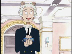
For the other styles, originally, I had only chose to do the style from Legend of Zelda Wind Waker and a style based of Jamie Hewlett of Tank Girl and Gorillaz fame. The first one I worked on was Wind Waker style. I had done this style before, drawing myself that way (see my last blog post for an image of that), so it was relatively easy, but fun. I was going to do this one digitally, but being as I drew the Gorillaz one on paper (I'll explain why in a minute), I doodled that on up too while in my sketchbook. Here's the scan of that:
The first time I tried this style, I just doodled up the sketch on GIMP (the program I was using at the time), but I guess it didn't matter how I did it, because I had to use GIMP to ink it anyway. The reason why I didn't use Sai was because GIMP has this lovely Pen Tool (much different from the PS Pen Tool) that emulates a calligraphy pen in a way, with different thicknesses and stuff depending on which way you write and pressure and such. I just traced over the doodle using that tool and got this lineart:

I found this works fairly well when copying WW style and looks similar to my references. Here were the ones I used and I got all these off the image galleries on CreativeUncut.com.


The top two here are actually from The Legend of Zelda: Phantom Hourglass, but the game uses a similar design as that in Wind Waker, they just ditch the inky, paper art for the games after WW. I only used those for ideas for Nikoloz's jacket. The bottom two are from Wind Waker and the one of the pirates helped for different facial shape ideas. If I just used refs of Link, Zelda or Tetra, they all have rounded faces so it would have been a bit difficult. Quill (the guy with the beak) helped with posing and proportion. WW characters have weird legs that shrink as you get closer to the foot (Quill's also one of my favourites in that game).

One of the issues I always have with this style though (the two times I've done it >>) is the paper grain effect they add on to the WW art. I seemed to mimic it fine using GIMPs weird filters (they have really weird filters... but they're still useful), but I had issues doing it on Sai. I didn't take it back to GIMP to do it, but instead used this feature on Sai where you can set the layer to a different grain type, like paper or canvas. Paper didn't look right when you used it, so I used one of the Watercolour options (there's two) and messed with the settings. It came out all right though it's still not the same exact paper grain (though I couldn't produce it on GIMP properly either).

For the background, I looked back to more of the official art, mainly this one:


I noted how it was nearly devoid of line (I think there's maybe a bit on the little bridge back there...) and focused basically on colour. The characters are popped from it by their heavier lineart, but the background still shares the same paper grain, which again I tried to mimic with the Watercolour layer setting on Sai. In the end, this is what I got:
The second style I tried to copy was again that of Jamie Hewlett of Tank Girl and Gorillaz fame. He no longer works on Tank Girl and I guess works mainly with Damon Albarn and the Gorillaz, but I still love his style. Really... if I lived in the UK, I would probably stalk him. But anyway!

For this style, I looked at a lot of his work and it was easy to do. I have Liz's copy of her Plastic Beach program from when they were at the Fox back in October (best concert ever btw) and her copy of the Gorillaz book Rise of the Ogre. I just stuck my nose in those for a few hours or so. However, here are some example reference pictures:


I still found replicating it a bit hard though. I had tried it before with another self portrait (again, see last post) and it was alright, but just alright. In the beginning of his Gorillaz work he had more vectored lines that had gradient shading on them and they were fairly simple in that sense. His more recent stuff is clear digital coloured pencil line (you can so tell by the line work) and it still sports a gradient like effect. I chose to do the more recent version of Jamie's style which is why I had to traditionally draw the lines. I had to redo it a few times though and this was the first sketch:


That one was dumped because I ran out of space on my page >>. Here was the second one and the one I used. The first one is the sketch and the second is the pencil trace over of the sketch. Hewlett's line are pencil, but they are neat unlike the sketch I had, so I had to retrace it for neater lines


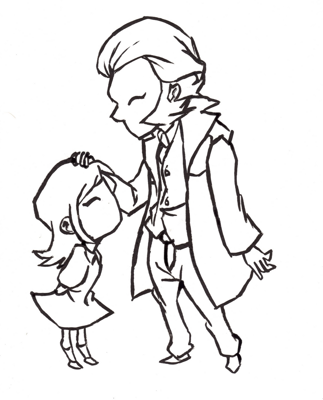
For Nikoloz in Gorillaz style, I drew him a bit more rough than usual and actually is, such as his tie hanging out of his waistcoat, his waistcoat not being full buttoned and his shirt being untucked. I thought it would fit in with the style a bit more.

To copy his colouring style, I just set the lineart layer on multiply and coloured under it, but I found I needed three other lineart layers on multiply with different opacities to get the line dark enough. The colouring was basically fill-in with a multiplied shadow layer on top that was then "gradiented" out with Sai's water tool (was Sai lacks a gradient tool).

I had issues with backgrounds, as most of the Gorillaz stuff is basically promotion stuff with them posing for album covers or in front of coloured gradient backgrounds. However, the Plastic Beach art has some backgrounds, like here that I looked at:


I didn't think that would fit with how I drew Nikoloz in Gorillaz style, so in the end, I just went with a very simple brick wall background that looked like it was roughly drawn and coloured and that seemed to fit pretty well. This was the finished bit:

Now, before I blabbed about these, I said "originally, I had only chose to do the style from Legend of Zelda Wind Waker and a style based of Jamie Hewlett of Tank Girl and Gorillaz fame" and I said that because after I got these two coloured (before I put backgrounds in; I put those all in last), I figured I would have time to do at least one more style, just for the heck of it. In the end, I did two more styles, just for the heck of it.

The first extra style I did was a style based off the art from the PS2/Wii game, Okami. Okami is a Zelda-like game where you play as the sun-god who has been sent to Japan in the form of a wolf to save it from demons using her Celestial Brush to harness the other brush techniques of the other gods who have fallen. It's a fun game, because you draw the attacks and it's very pretty, utilizing a watercolour like feel to both the line art and the in-game graphics.

Here are the refs I was looking at, again, taken from CreativeUncut's art gallery for Okami.


This one I had a great deal of trouble in replicating, not know how I was going to do the watercolour like effect. I had started it digitally and didn't really have the means of doing traditional watercolour at home. However, seeing as this style had varied line weight that was sort of like WW's lines, I attempted to try that first. Here was the lineart from that first attempt:
Originally I thought this would work and played with colouring it on Sai. I had to inquire with Norma on Sai's tools (she's much more familiar with the program than I am) to see if there was a way to have a watercolour like brush. There isn't a set tool for it, so I was basically playing with the different tool settings for a few hours. I got something coloured that I thought look much like the style, but after getting the opinions of a few people (a few people from a Tron based chat, my friends Heidi and Kristina, Kevin), I found that the lineart I had done just wasn't working (and I had to bump up the colours, they were too dark at first).

Kevin said that the lines were definitely traditionally done and Heidi said that I could really use the papery feel she said was present in the official art. I didn't know how I could do either due to limitations of both my household supplies and program restrictions, but I remember then that I had watercolour paper and calligraphy ink. So, I printed off the lineart above and traced over that on watercolour paper using a paintbrush and the ink and got this:

The line weight here wasn't as varied as before, but it was much heavier and being as it was actually ink on paper it looked like... well, ink on paper. I was actually happy with it and this time around I also took note of an observation made by my friend Kristina. Okami art doesn't really have that many smooth curves to the lines. If you look at them, the lines are segmented into shorter straight lines, so I applied that idea to this lineart.

So, what I did for this was instead of recolouring everything, I just plopped the lineart over the colours I already had down and put it on multiply and played with the opacity and strangely enough, it worked. The colours didn't match up with the lineart, but that was fine, as in the official art, the colour bleeds occasionally from the lines there too, so it look a lot better.

For the background, I looked at some of the promotional art. It was just more watercolour like work, such as here:


I didn't go and do elaborate linework for the background though and basically did a quick soft background up with Sai's marker tool, which layers down lower opacity layers and gets darker the more you go over it. I made it look blotchy-ish for watercolour effect and came out with this:
The fourth and last style I tried to copy deviates from my other choices. It's not game art this time around and isn't really anyone people of mainstream knowledge would probably know. I saw an awesome speedpaint the other day of my favourite Tron character, Clu 2 on DeviantArt the other day and checked it out. Here's the picture:


Original post here: http://altana.deviantart.com/art/C-L-U-Quickpaint-194072277 If you're on dA, go fave it now. Go. 

Anyway, I really really really really really really like her stuff. It's loose, but painterly and when it comes to painterly styles, I kinda like loose, kinda sloppy application. That deviation also has links to process blogs and I was looking at those and I decided to do something kind of like this, though it certainly didn't take me no 20 minutes because I can't paint or digi-paint to save my life unfortunately.

I don't have as much process stuff for this because it was like... last minute, but what I did was read over her process blogs a lot and tried to copy it, but I think I ultimately failed, because it doesn't look much like her stuff. However! It does look much more painterly than anything I generally do and this was the first one I actually slapped a background on that I was happy with. Usually when I do backgrounds, they're simple and stupid and lame, but here, it was actually... okay! And I was like YAY! and stuff... 

But mine doesn't seem to have that heavy brush stroke feeling to it and I think I blended it too much or something... I might try it again later to see if I can get used to it or something. But anyway, this was that last style:


So yeah. That's Nikoloz for my second assignment in Environments and Characters. I think I'm gonna stop writing now, because I think I'm actually out of process stuff. That and I think I've posted enough anyway :p Whatever; there's more to come, as we get a new project this week :) Ta~